PitchBook is a financial data and research platform that provides information on private and public companies, investors, deals (like venture capital, private equity, and M&A), and market trends.
.svg)
Improved analyst workflow efficiency by 4 hours per day

Reduced 23% of support calls about Leveraged Loan Indexes
User research, product design, prototyping
Design lead (1), product manager (1), solutions (3), data analysts (1), developers (3)
Figma, Zoom, LucidCharts
PitchBook Data
This is a limited case study. Please contact me for more details.
.svg)
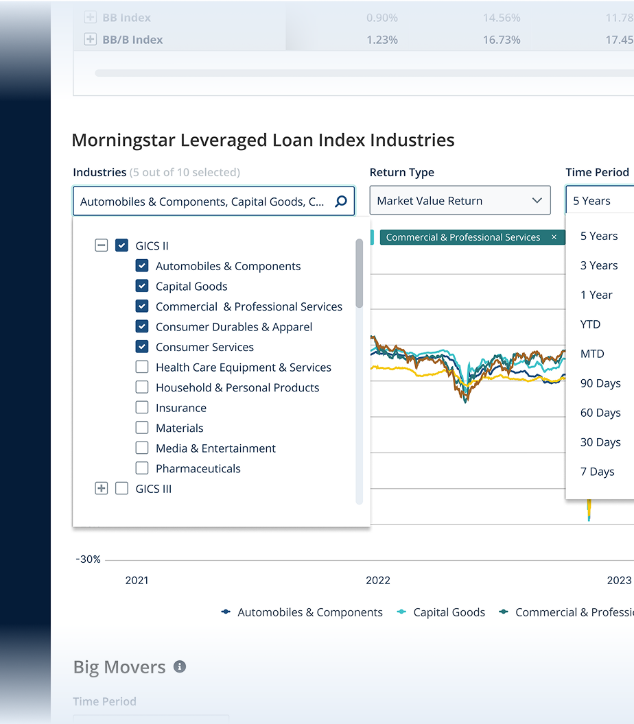
With the acquisition of Leverage Commentary Data (LCD), PitchBook brought in a plethora of Leveraged Loan indices to their platform. However, this access was only available through two main methods: APIs and direct excel downloads. Because the nature of excel files were static, they saw a demand to integrate these reports into their platform as market analysis tool.
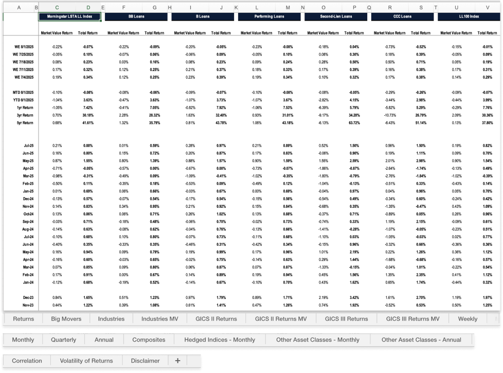
Through semi-structured user interviews I conducted with proxy users, I discovered two main users of this data: managing directors and analysts. I also identified 3 key pain points that applied to both group’s workflows.
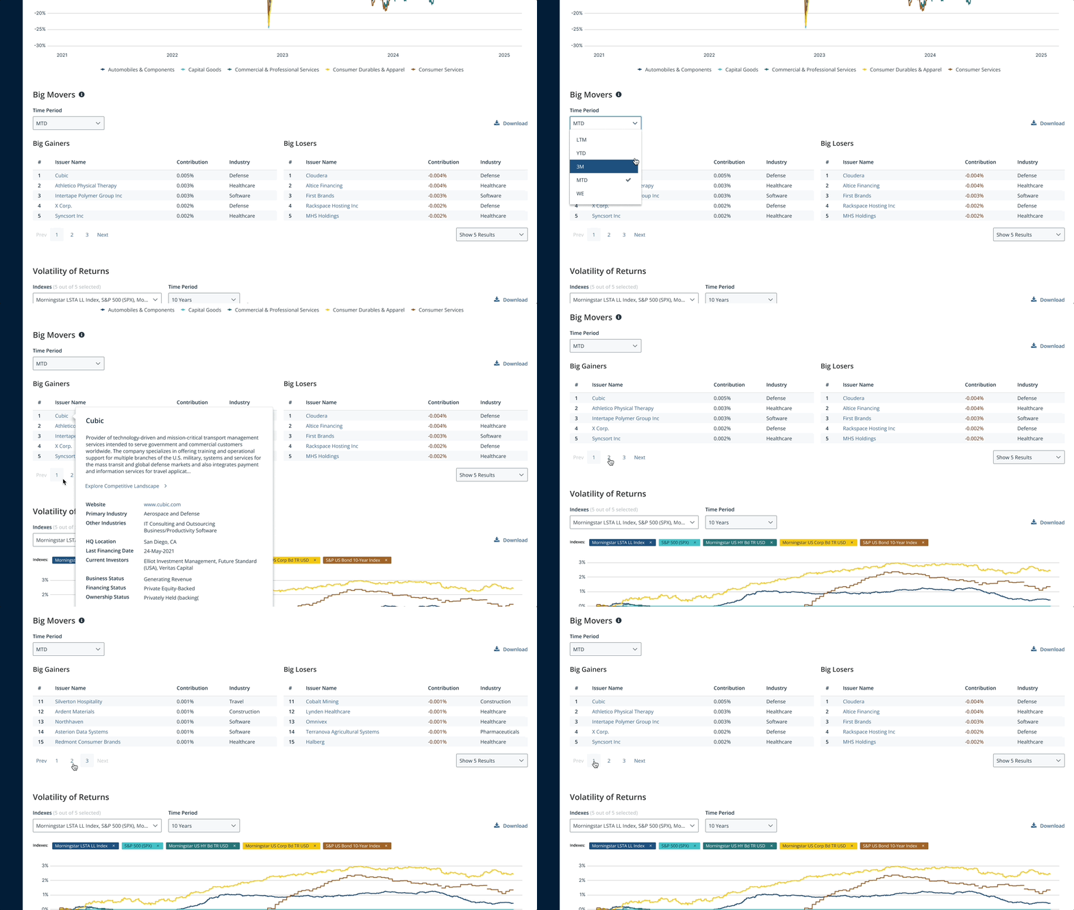
With 18 tabs and 80+K data points, getting specifics of a few loans that they worked on was a challenge. Plus, every week, they had to download, extract and break out the data just to see the value of the updated index they were working on.
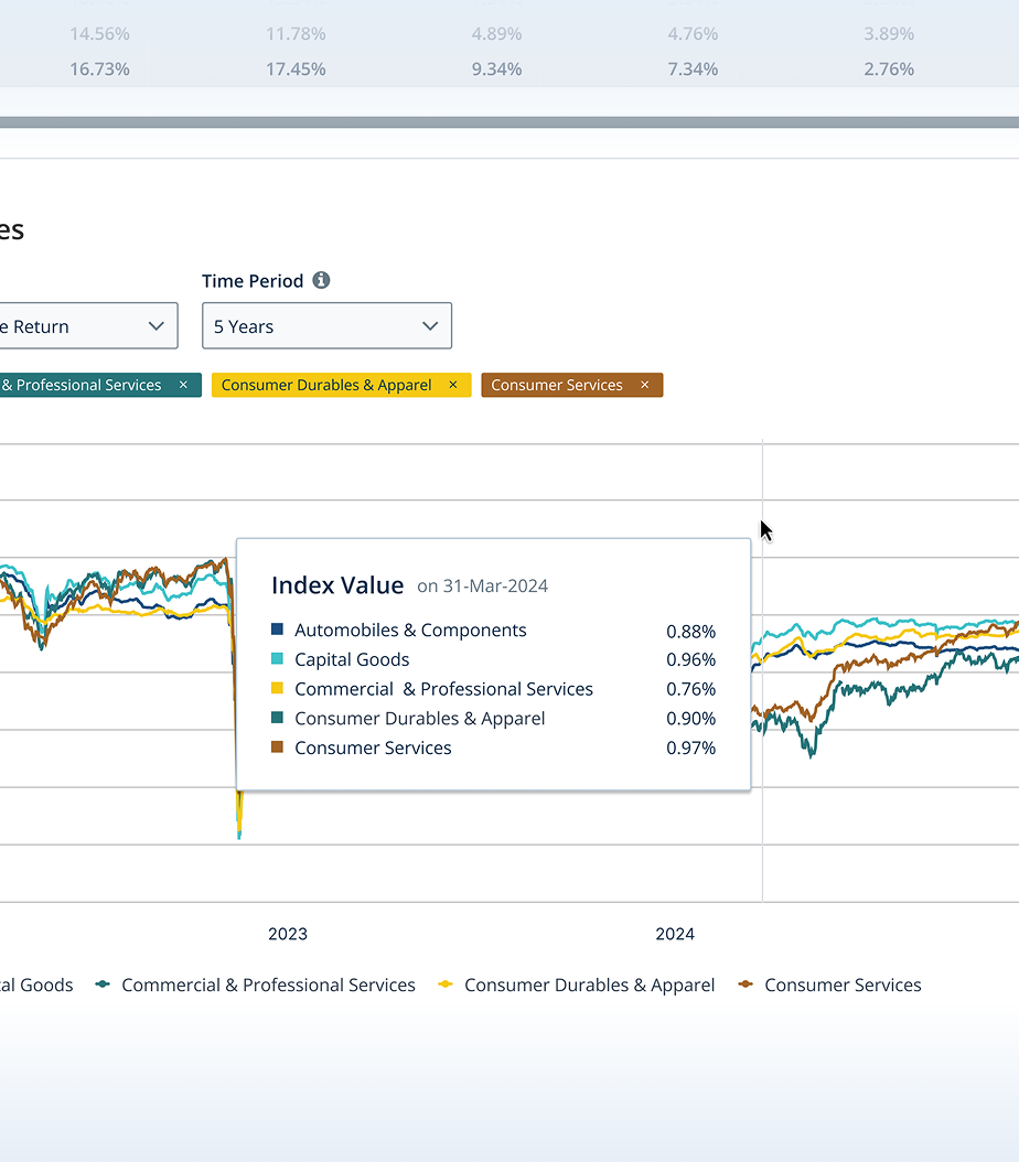
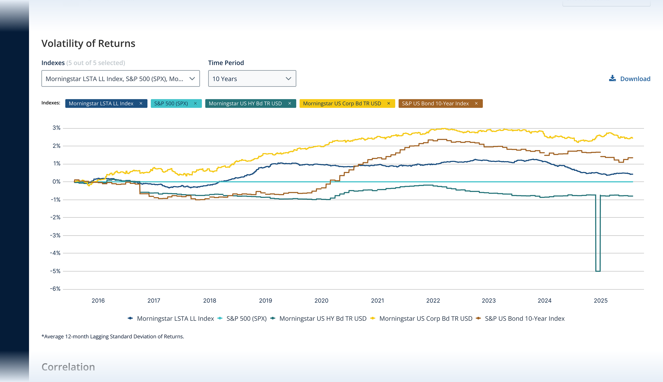
Due to static file structure of the excel files and the large number of data on each tab, seeing the trends required additional steps. This elongated users access to meaningful data and slowed their benchmarking processes.
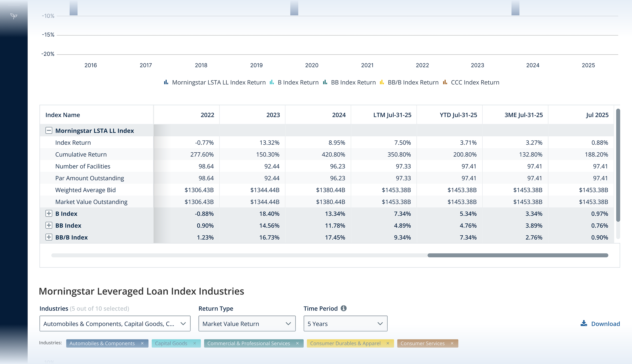
The data included in this sheet did not have any extra information about the calculation of the numbers. This made the users reach out to PitchBook just to ask clarification questions about the calculations.
.png)
.png)
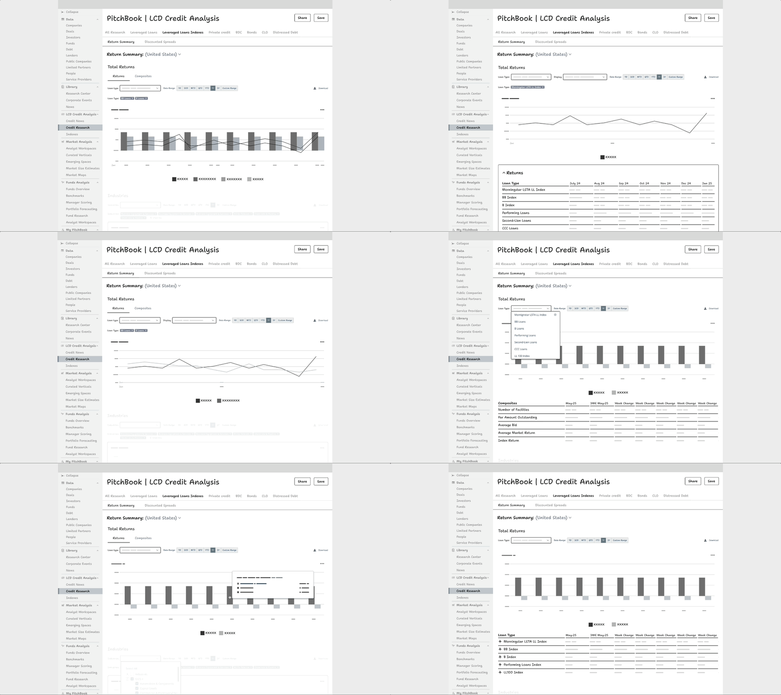
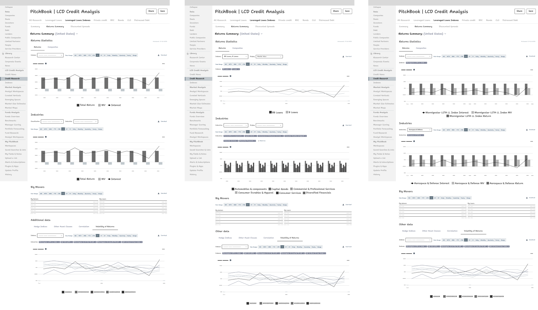
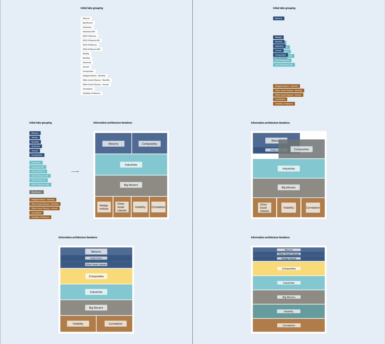
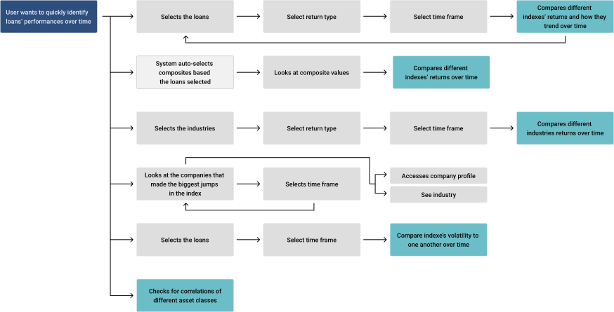
Started by grouping and consolidating relevant data points. Then organized based on the most to the least used tabs and iterated further based on more user feedback.
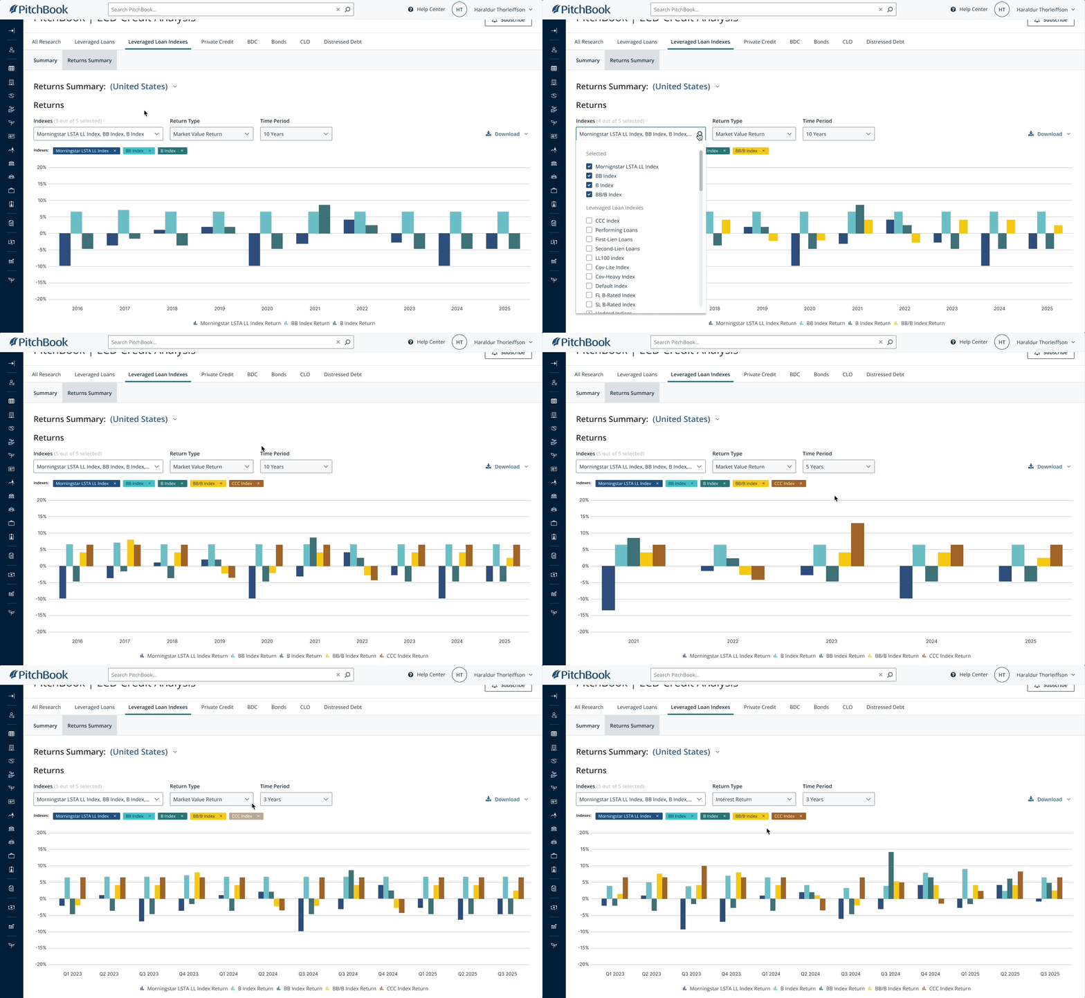
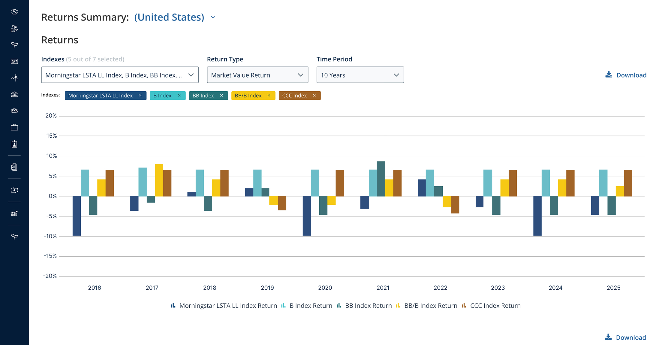
Based on long-standing reports, the team was accustomed to a specific chart style and wanted it replicated on the platform, even though another format would have been more effective. This preference limited the amount of data we could display
Managing stakeholder excitement and multiple requests required a collaborative approach. I worked closely with the product manager and the team to prioritize needs, define the roadmap for the minimum viable product (MVP), and ensure we could move the project forward within the given timeline