Overview
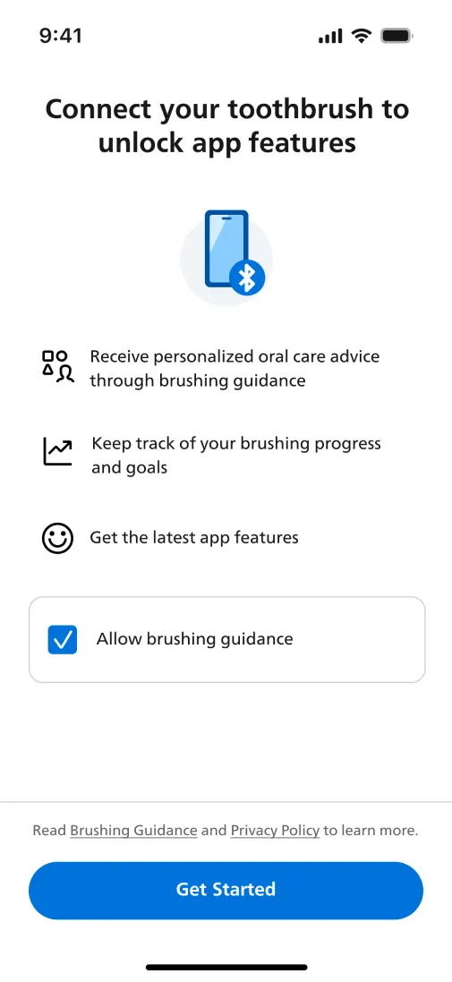
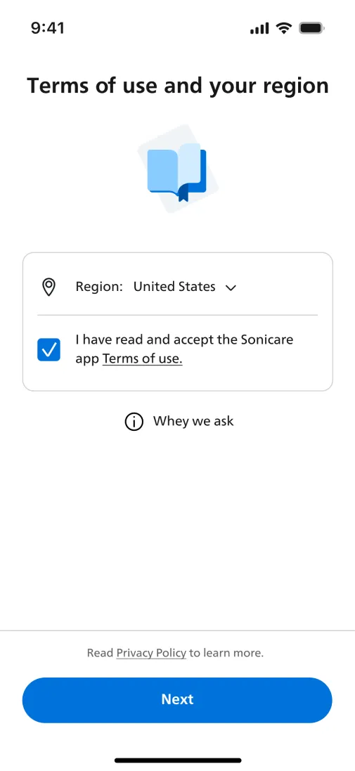
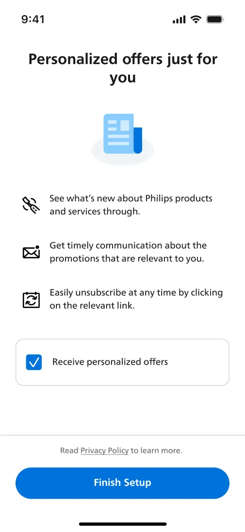
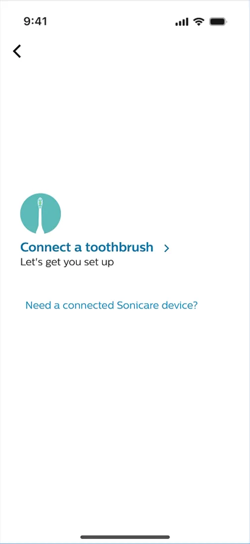
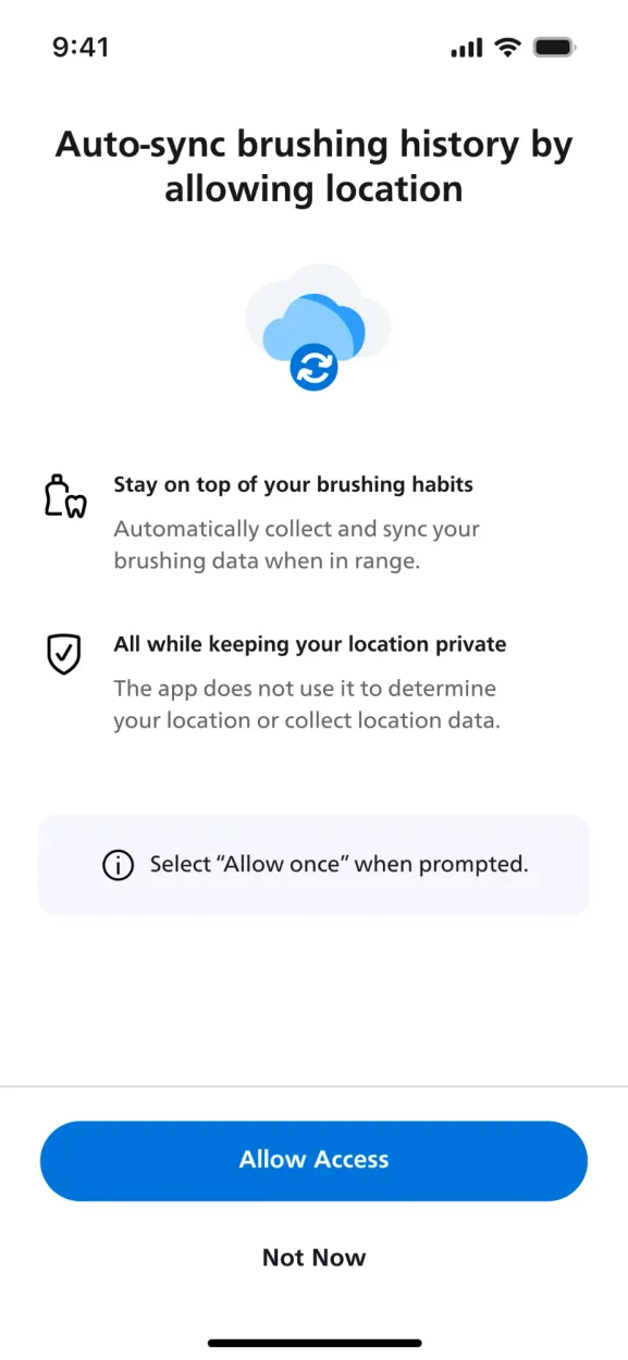
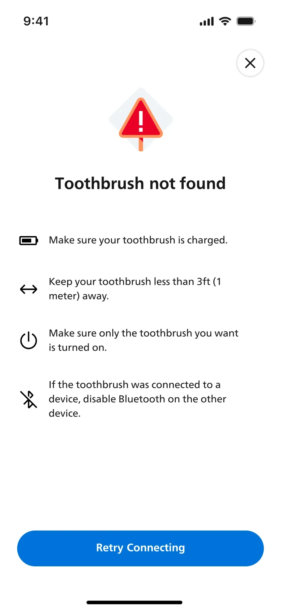
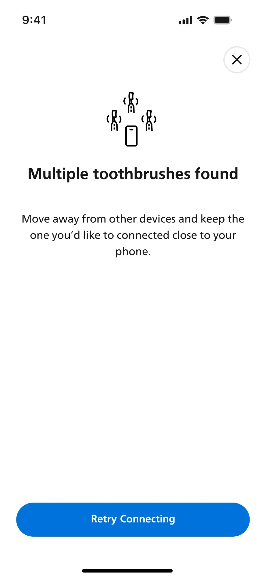
A less-wordy, informative onboarding experience with visuals to break language barriers and better usability for a global user base.
Philips Oral Healthcare is a division of Philips focused on improving dental hygiene and overall oral wellness through innovative technology. It’s best known for its Sonicare line of electric toothbrushes.
Impact
16%
faster onboarding experience by optimizing the flow.
2M+
customers across 24 markets and 26 languages use the structural changes today to onboard.
- Contribution
- Heuristic evaluation, product design, motion, usability testing
- Collaboration
- Design lead (1), product managers (2), analytics (1), localization (1)
- Tools
- Figma, AfterEffects, Miro
- Client
- Philips Oral Health Care division
- Notes
- This is a limited case study. Please contact me for more details.
Business problem
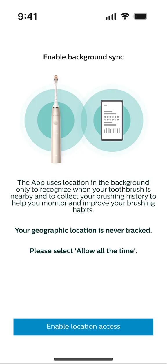
Outdated screens, inconsistent with the new design system.
After years of neglecting their mobile app, Philips Sonicare refocused on improving the digital experience. The outdated onboarding lacked clear consistency with the new design system that the Philips design team had created. As a result, they wanted not only to update it to the new look, but also optimize it when possible to make the process seamless for the users.
User problem
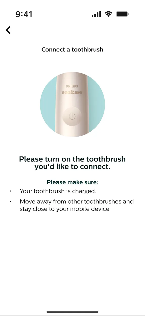
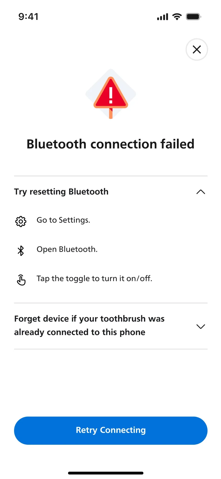
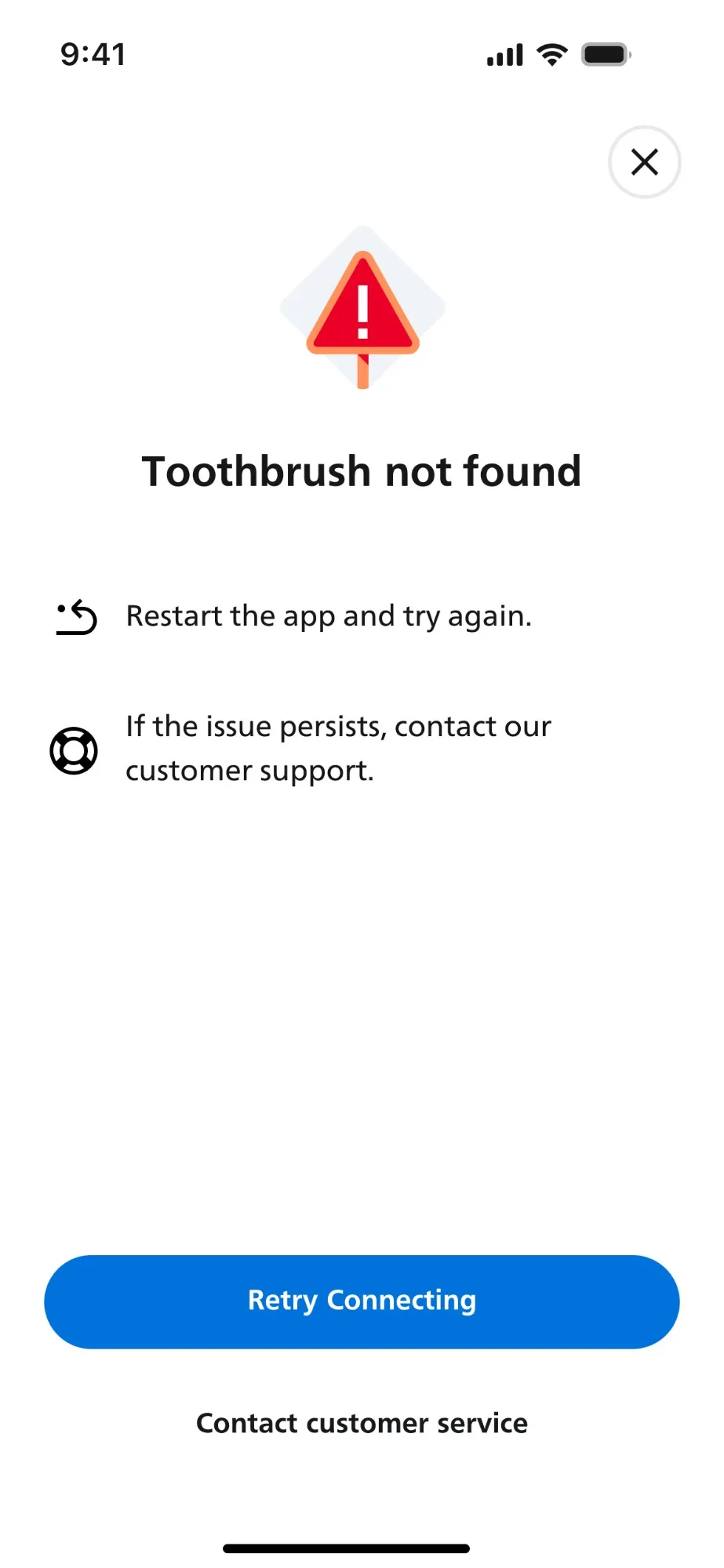
Inaccurate information caused connectivity issues.
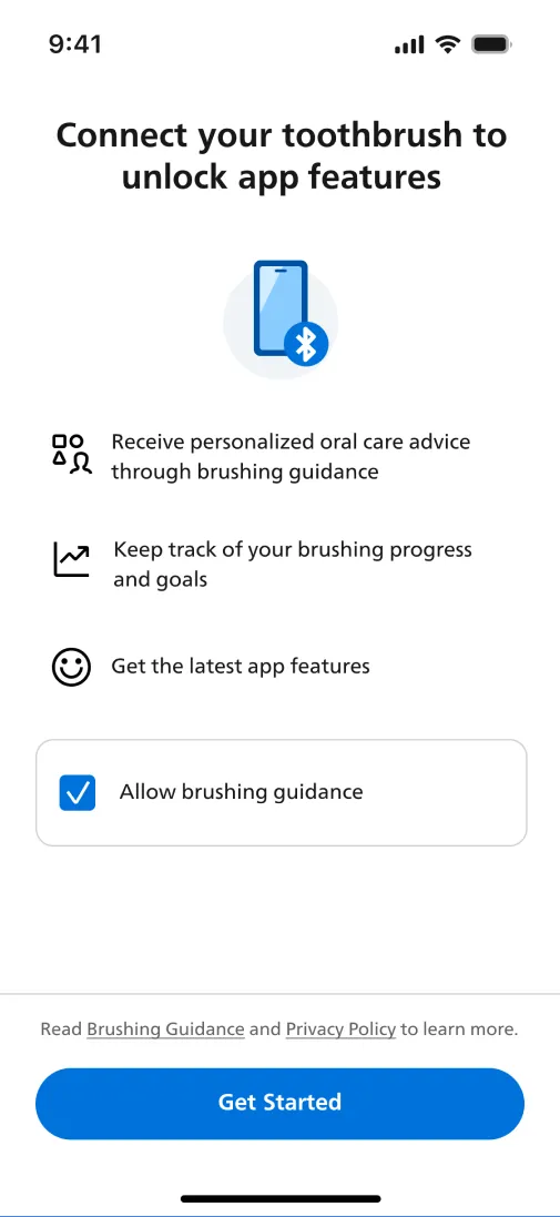
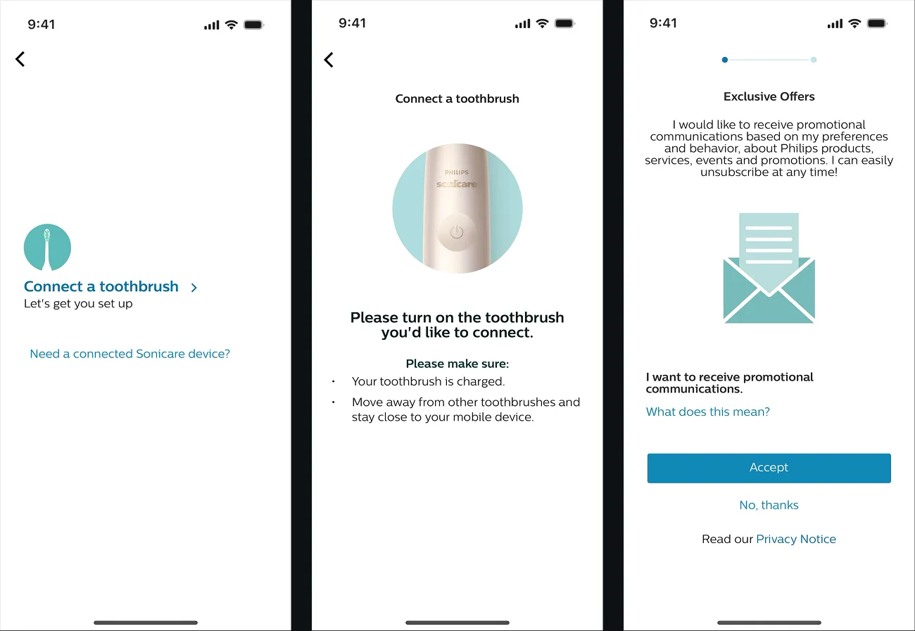
Static and text-heavy content did not convey the premium quality experience.
The app relied heavily on static, text-dense screens that felt uninspiring and failed to capture the essence of a premium brand. Without engaging visuals, motion, or interactive elements, the experience felt more like reading instructions than using an innovative product.
Information hierarchy focused on system function than user needs.
Instead of guiding users through intuitive steps or personalized insights, the layout prioritized technical details and legal needs. This approach created confusion and reduced the overall usability and emotional connection with the product.
Design decisions
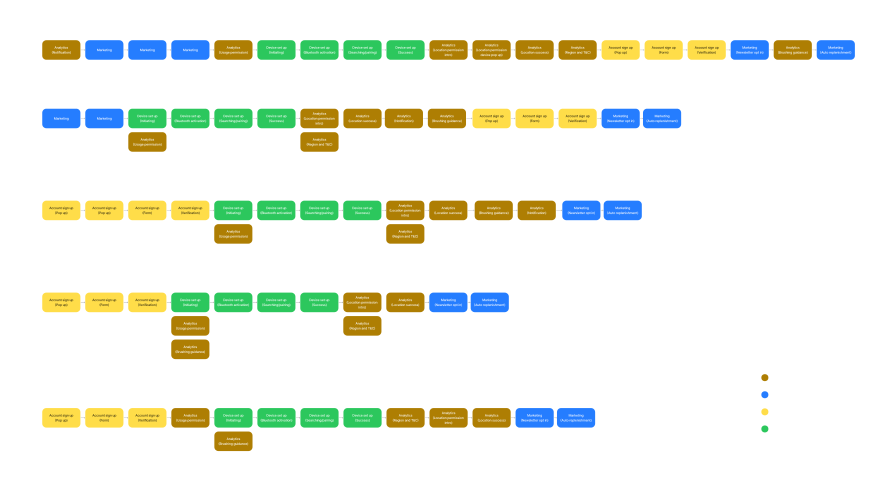
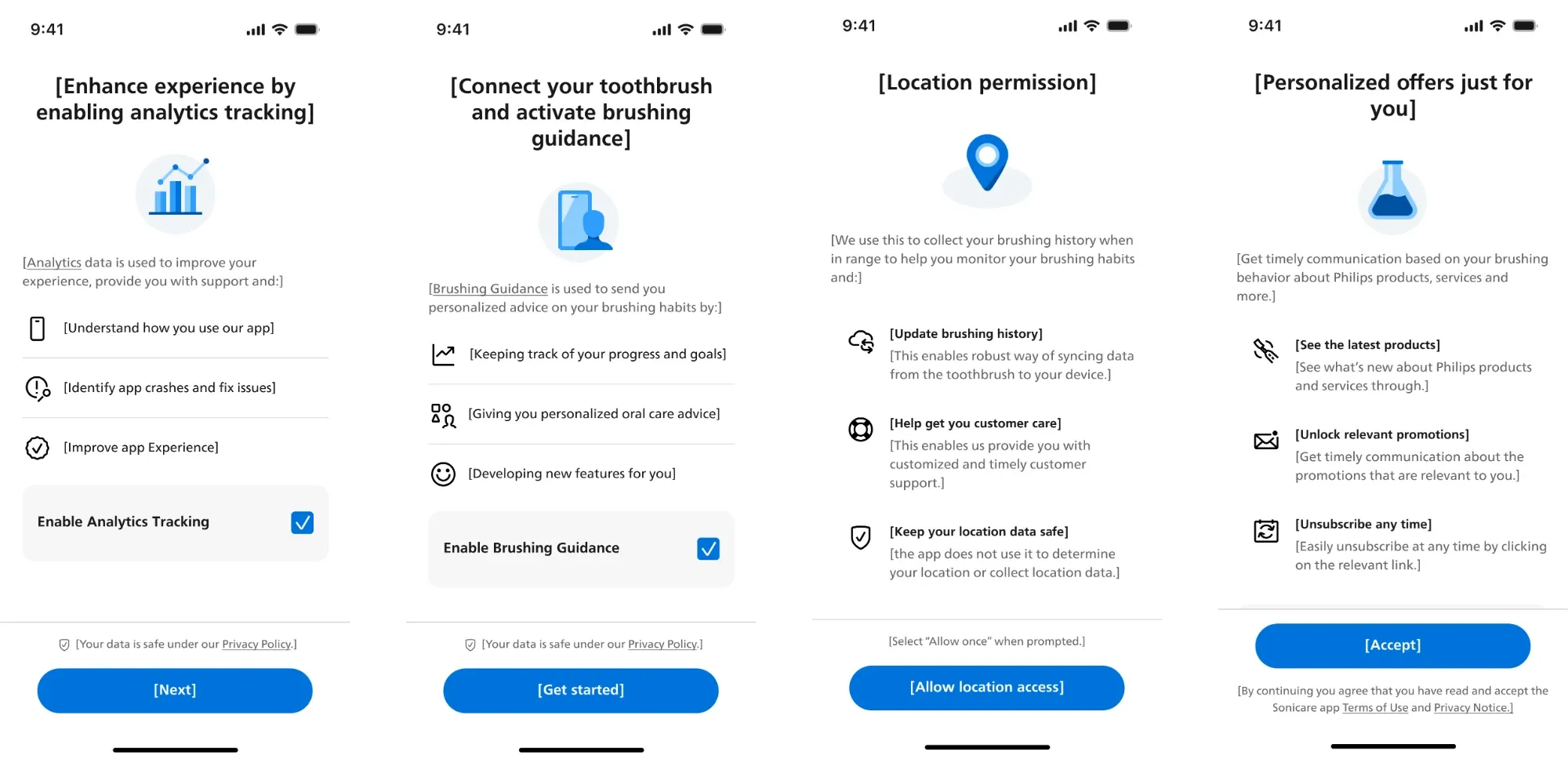
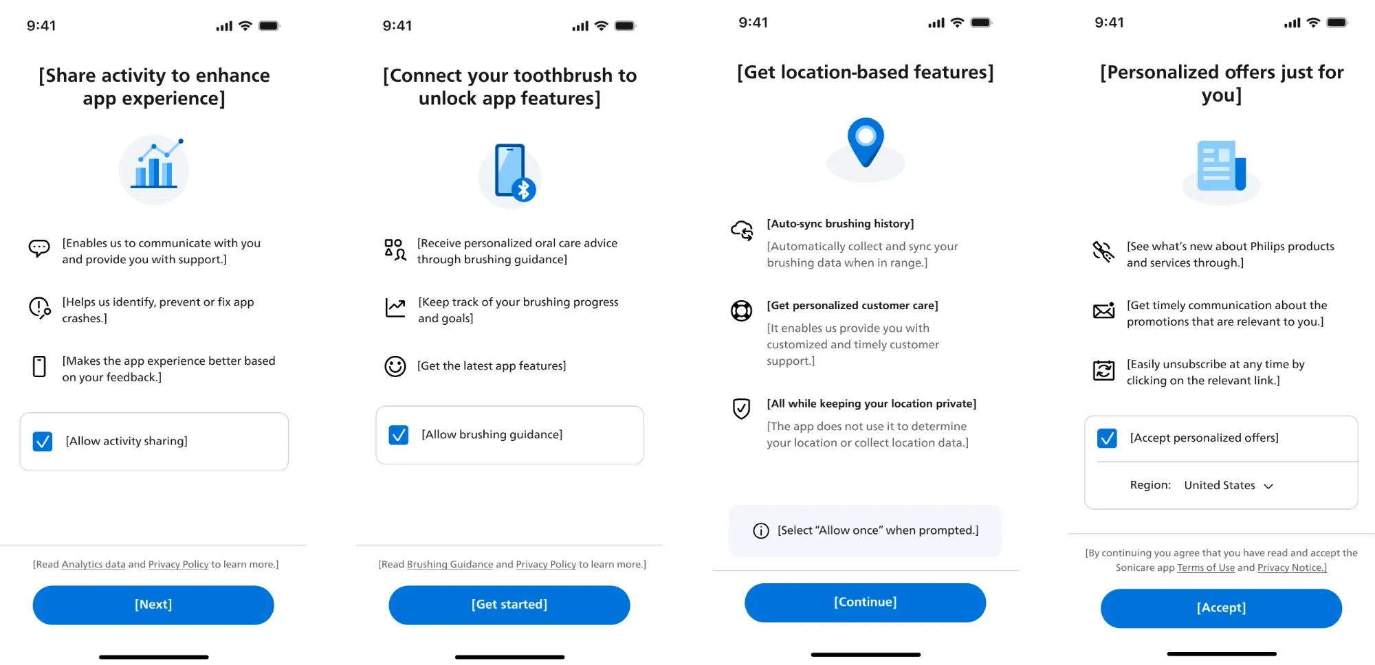
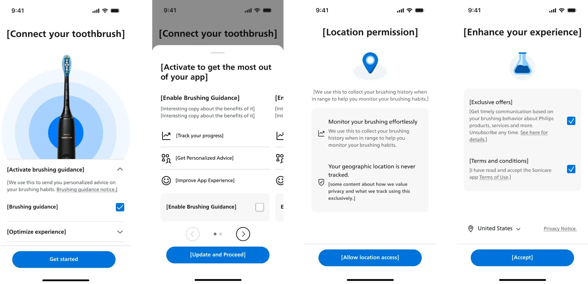
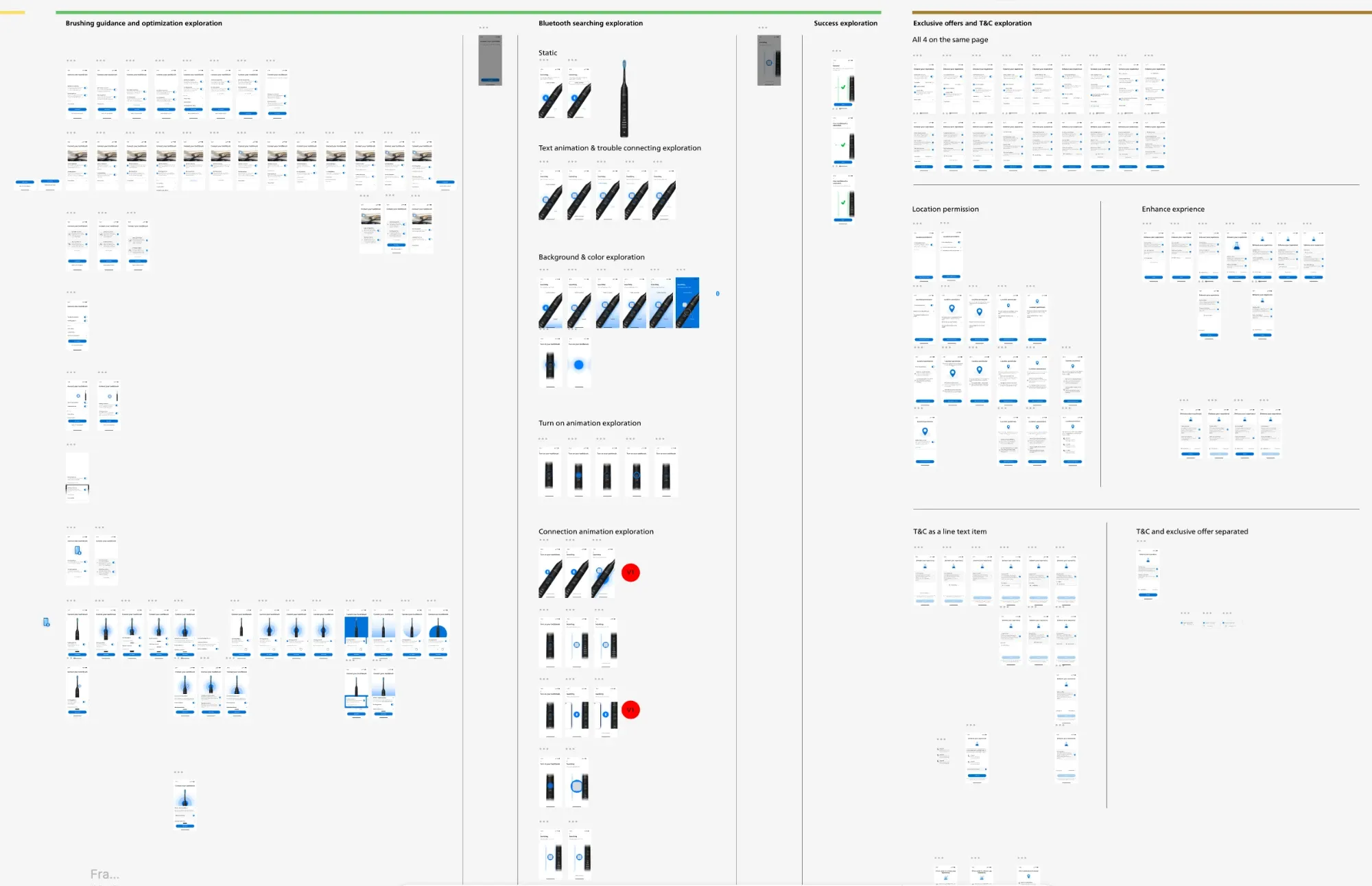
Mapping out and optimizing the user flow.
I mapped out and optimized the user flow to create a more intuitive and seamless experience. This involved analyzing pain points in the existing journey, identifying moments of confusion or drop-off, and restructuring the flow around user goals rather than system processes.
Challenges
Balancing tech, legal and user needs at a global scale.
Priority of some screens were informed by tech limitations.
The app relied heavily on static, text-dense screens that felt uninspiring and failed to capture the essence of a premium brand. Without engaging visuals, motion, or interactive elements, the experience felt more like reading instructions than using an innovative product.
Needed to consider localization and regional legalese.
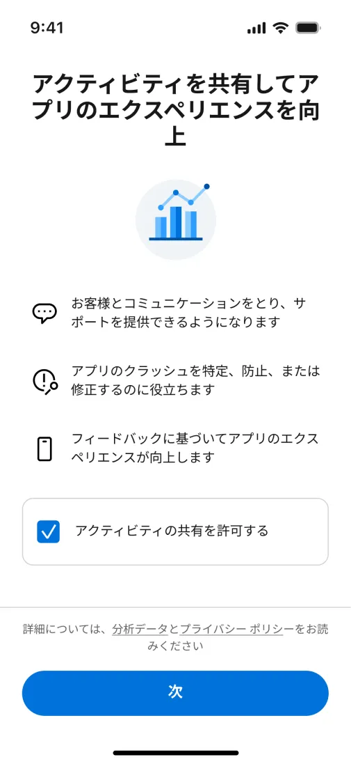
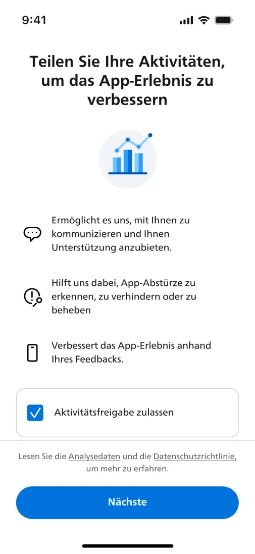
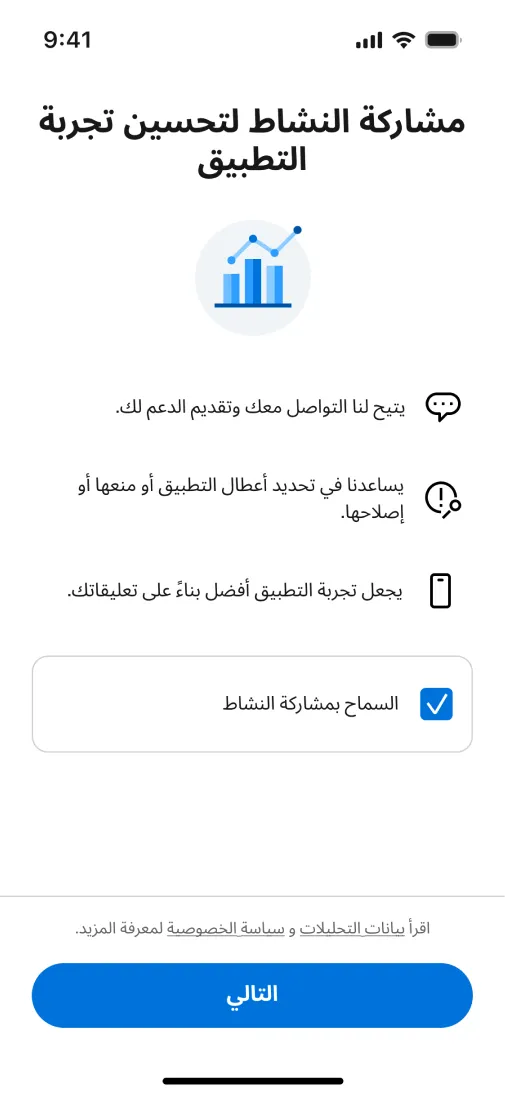
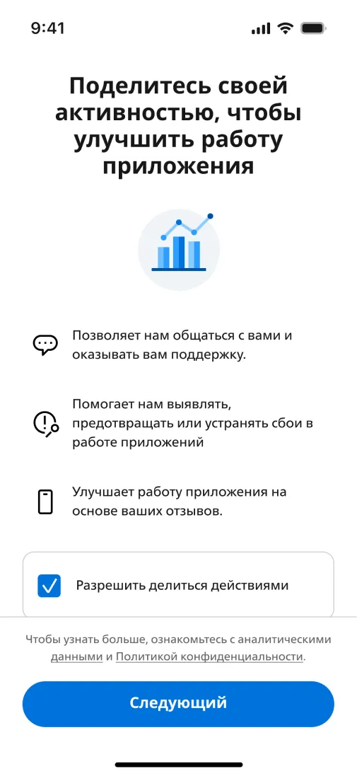
Content, terminology, and instructions had to be adapted for different languages and cultural contexts, while ensuring compliance with regional healthcare regulations. This added complexity meant that every screen and interaction needed to meet both user comprehension and legal standards.
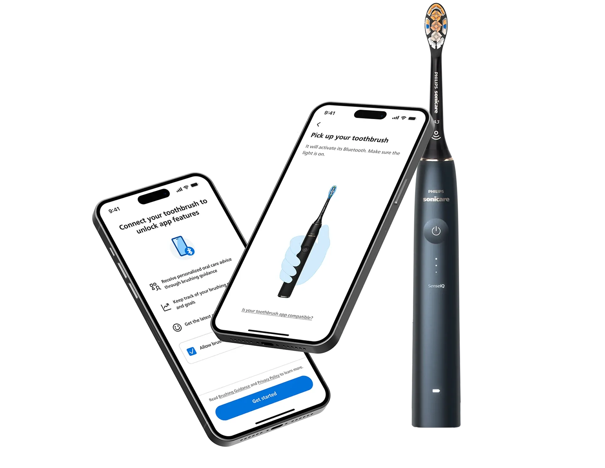
Solution
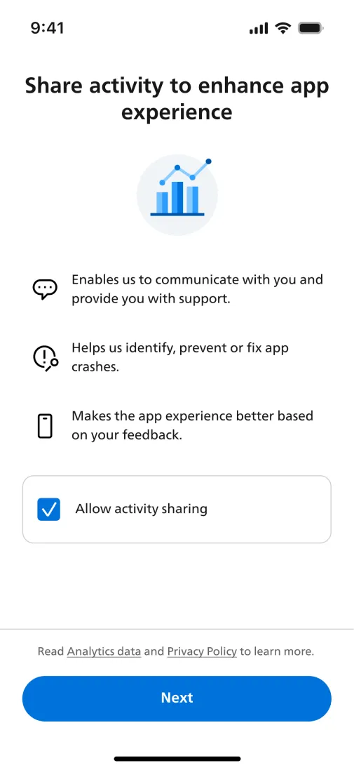
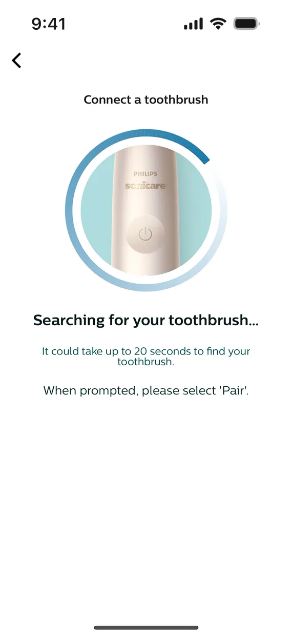
Faster and more visual onboarding experience for 2M+ global users.