Overview
As part of Gerber Life, a trusted name in insurance, Fabric blends innovation with reliability to meet the needs of modern families by offering Term Life Insurance and kids investment account.
Fabric by Gerber Life is a digital-first life fintech platform designed to simplify the process of purchasing life insurance and UGMA for families. It offers products that are easy to apply for online, with an emphasis on quick approvals and a straightforward user experience.
Impact
4.3%
of increased throughput as a result of new educational screens.
Alignment
between marketing, product and engineering teams.
- Contribution
- Generative research, product design, prototyping, usability research
- Collaboration
- Design lead (1), product manager (1), engineering (1)
- Tools
- Miro, Figma, Usertesting.com
- Client
- Fabric by Gerber Life
- Notes
- This is a limited case study. Please contact me for more details.
Business problem
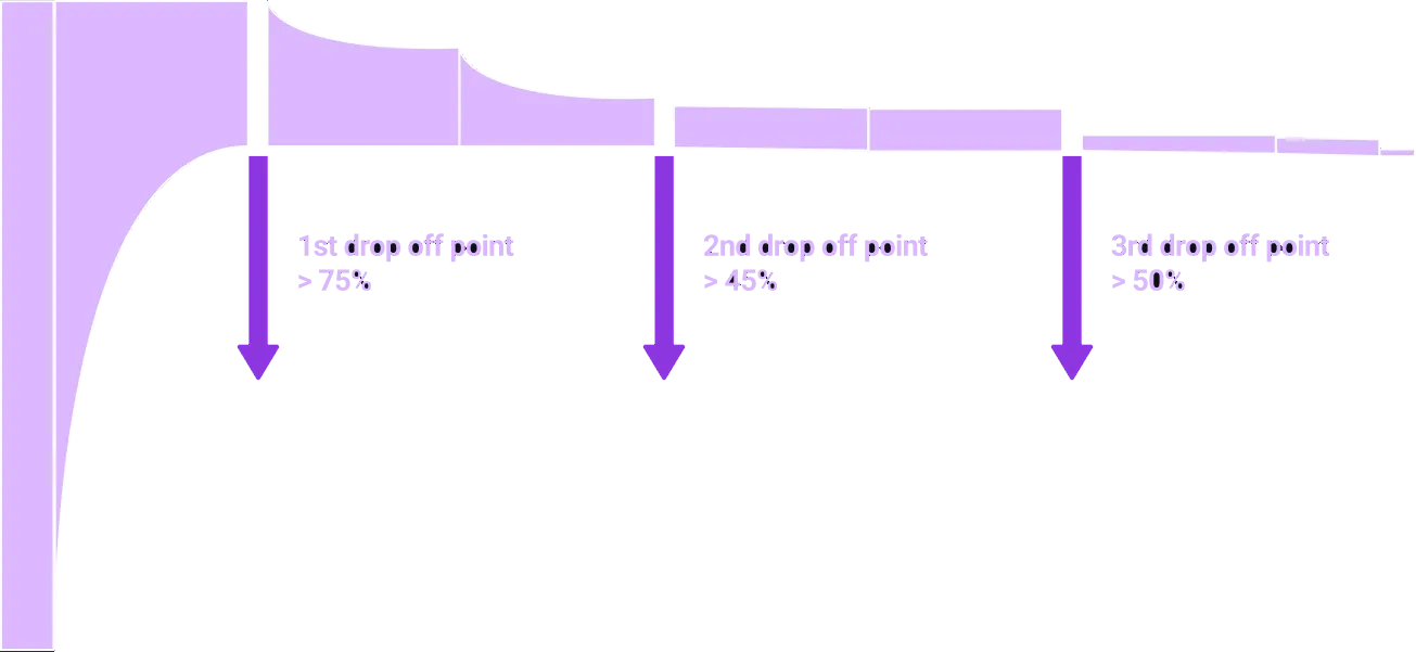
Drop offs at multiple points during the funnel.
In Fabric’s UGMA funnel, we saw a significant drop-off at multiple parts of the funnel. Even though the team has worked on optimizing the experience, we wanted to take a step back and better understand user motivations and intents when they approach opening an account with us.
User problem
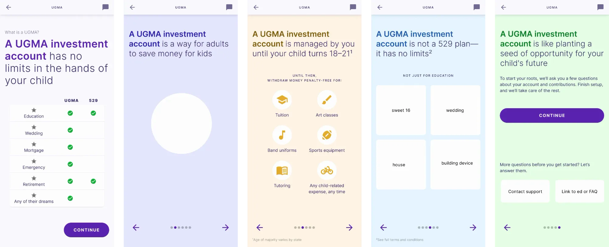
What is UGMA and what can it do?
As the sole ux researcher of the company, I ran user interviews with 11 users and, to analyze the data from the user interviews, I employed affinity mapping to identify common themes and patterns. Below are the three main reasons for drop offs:
Users didn't know what UGMA is.
User quote: “It's a savings account, maybe better, honestly I don't know.”
Value of their investment is not contextualized.
User quote: “I want more knowledge on the risks and what to invest. I don't know what am I looking for.”
Design decisions
Fast iteration driven by user feedback.
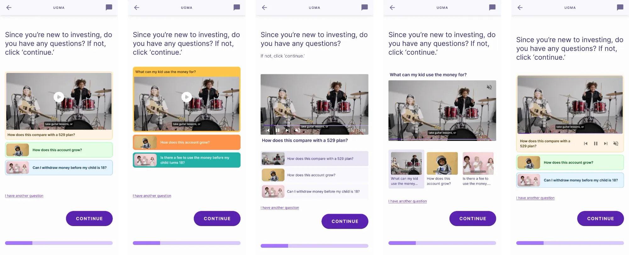
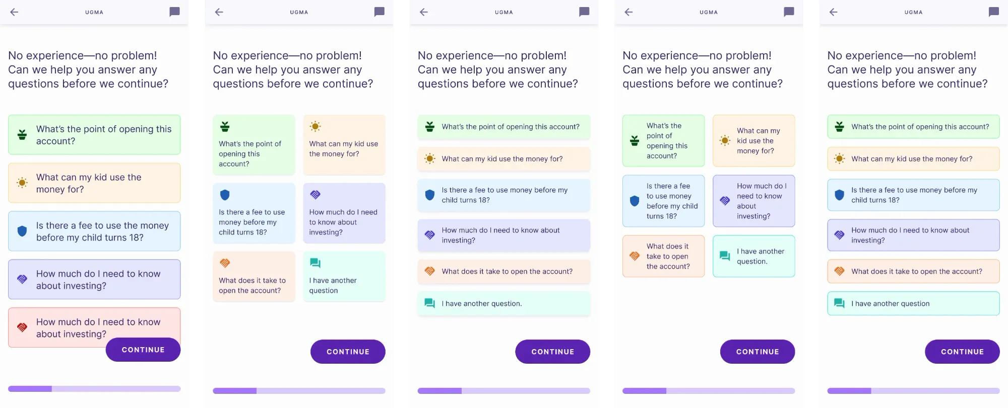
Using usertesting.com, I held multiple user testing sessions before finalizing the product. I was responsible with not only designing the tasks and the research plan, but also synthesizing the data gathered from it and communicating that with the PMs and the design team.
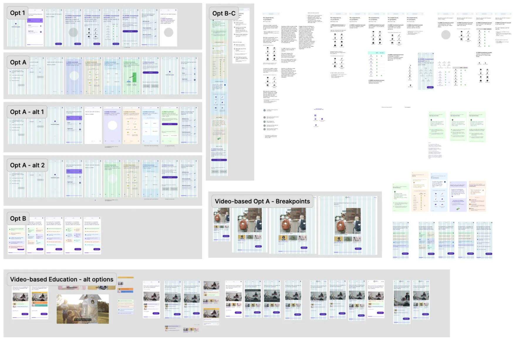
Challenge
Designing with time and engineering constraints.
Designed in tandem with engineering constraints.
To be mindful of the time we had for that sprint, I constantly talked to engineers and the PM to understand how the design solution could be in tune with their workflows and expectations.
Considered the timing and the low resources.
Because we approached tackling the lowest hanging fruit of the identified issues, the new solutions should have been ready by the next sprint, giving me only 2 weeks to design a solution.
Solution
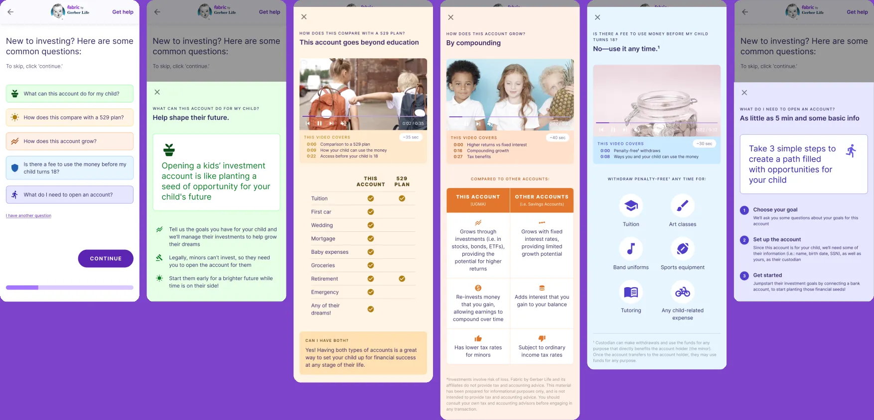
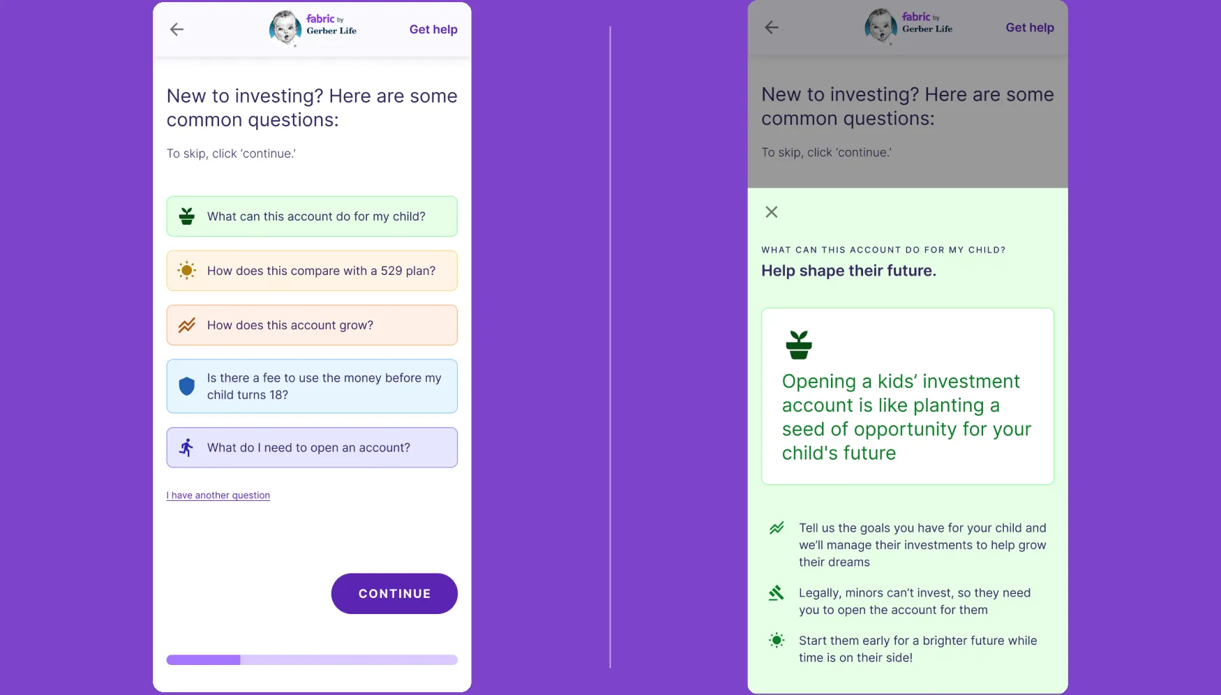
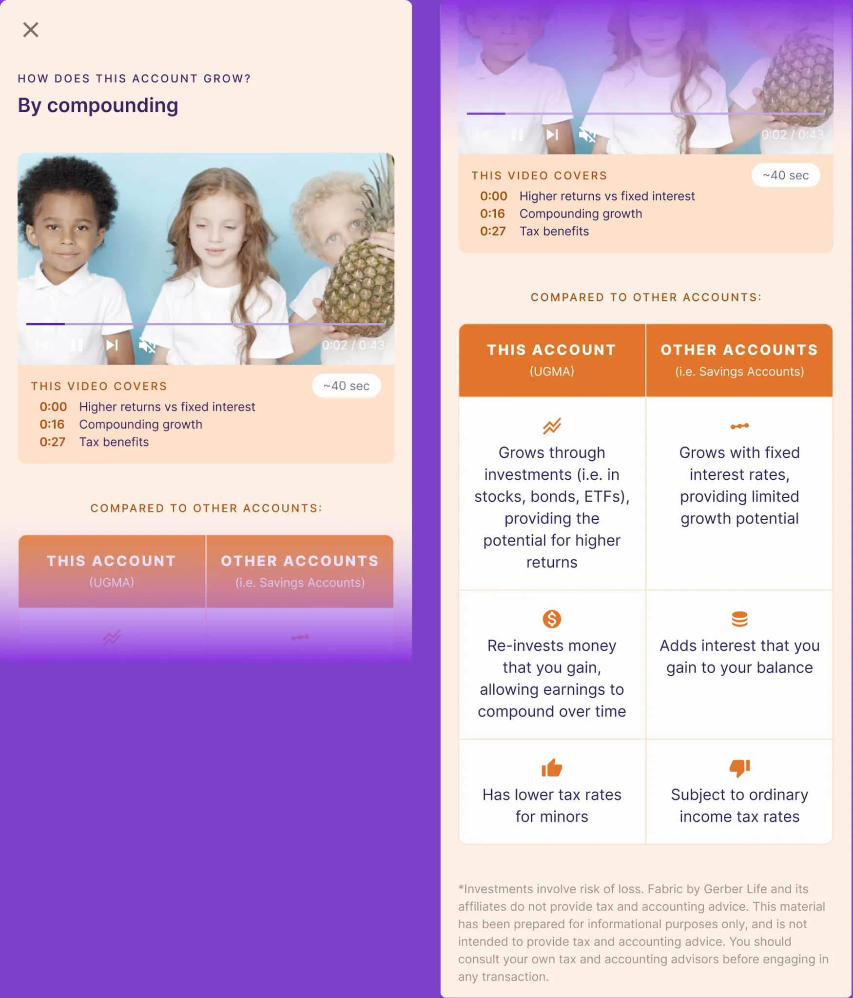
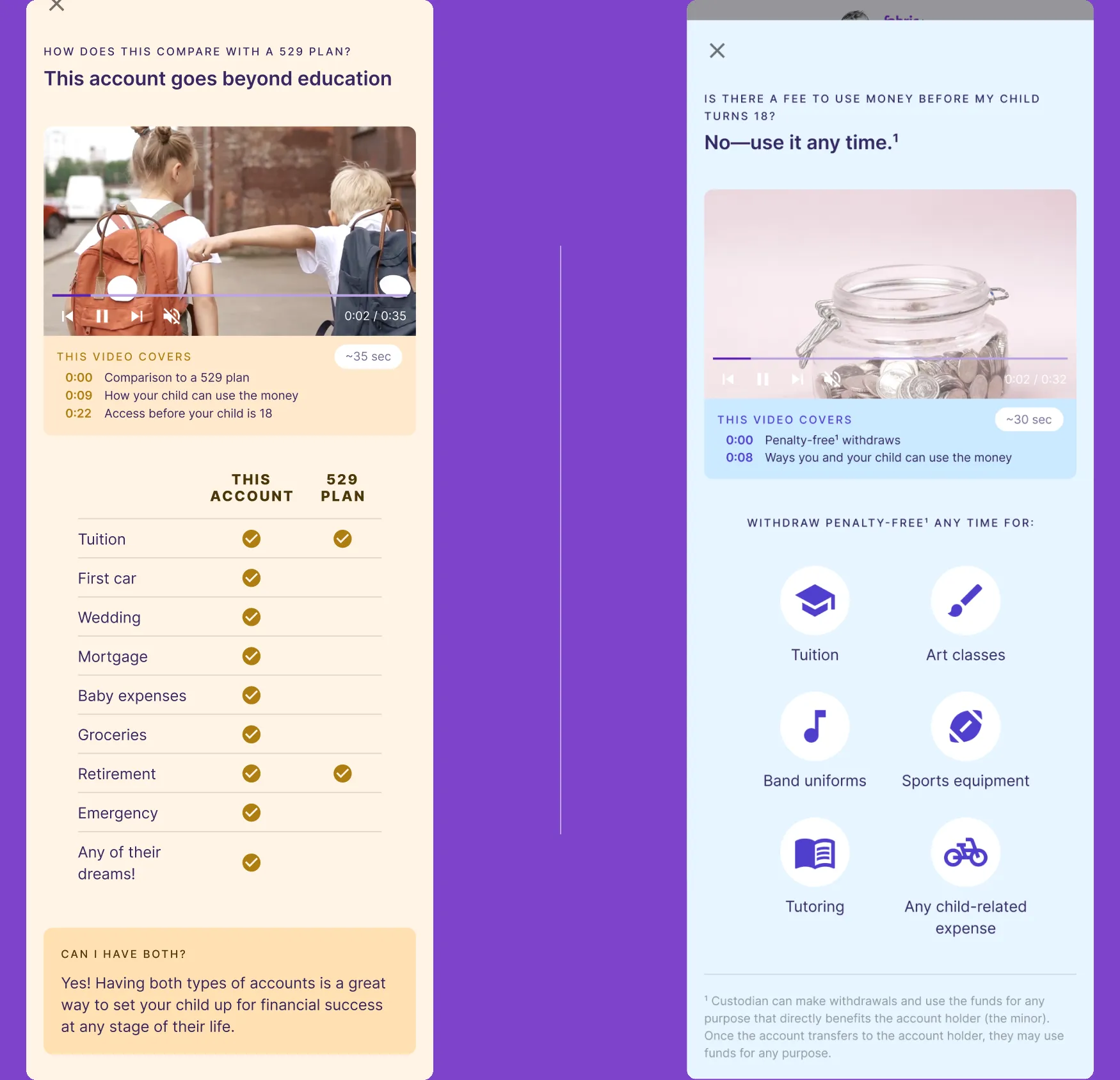
In-funnel educational financial content when users need it the most.